Extending community: how to integrate private places and public spaces
Offices, hospitals, even power stations should not feel like alien buildings dropped into local communities, but should enhance their neighbourhoods and foster a sense of civic pride. As architects and master planners, here are our five insights for successfully integrating private or functional buildings into public spaces and communities…
If you ask someone to consider the physical ‘building blocks’ of a local community, they might mention parks, residential streets, independent shops, pubs and cafes, perhaps churches or schools. It’s rare to think of contemporary office blocks and administrative centres, clinical buildings or power stations in those terms, although they exist in the same geographical location. Very often, those kinds of functional or private places are at best invisible to local residents and at worst alienating or oppressing.
But it doesn’t have to be this way. Hospitals can be attractive, welcoming places; scientific research centres can blend with local environments and connect people to nature; district heating systems can be beautiful, distinctive parts of the streetscape. Here are five insights from a range of Cullinan Studio projects that show how with good design, ‘community’ can be extended to those buildings that are never usually associated with the concept…
Bunhill 2 Energy Centre, London Borough of Islington
1. Collaborate with users and the local community on building design
The Bunhill 2 Energy Centre in Islington is a district heating system like no other: it extracts waste heat from the London Underground and uses it to heat local homes, classrooms and swimming pools. But it is also a striking architectural structure in itself: a feature of beauty and interest that redefines a street corner in what was a forlorn, neglected site. It does not look like a power station dropped onto the city street, but an attractive enhancement to the area – one of which local people can be proud.
A key reason for the success of Bunhill 2 is that it was designed in collaboration with local residents. Cullinan Studio ran workshops with members of the community, incorporating their feedback into the design process. Effective collaboration, co-design, and the establishment of ‘critical friends’ within the local community right from the earliest stages of a design project are vital if functional structures are to integrate successfully in a neighbourhood.
2) Work with the local character and cultural context
Although conceived as an engineering project, Bunhill 2’s location meant that it would be encountered as a building, so it was consciously designed to contribute to the streetscape and character of its Islington locality. Black glazed brick charcoal vitreous enamel steel and deep-red metal cladding reference the materials and colours of the Underground, while cast aluminium relief panels by artist Toby Paterson take their inspiration from the local estates.
For Cullinan Studio’s own building – a retrofit of a derelict warehouse by Regent’s Canal – designing in the local Islington context was also critical. The waterways of North London have become thriving communities of homes, cafes and offices but their visible roots in industry are essential to their character. The ‘Foundry’ retrofit was designed in this context and, as a prominent feature by the canalside footpath, it contributes to that local identity by using contemporary techniques to preserve historical architectural features, most obviously the listed south wall.
The Foundry Co-Working Hub - home to Cullinan Studio and several innovative organisations working in the built environment
3) ‘Open up’ private buildings within public spaces
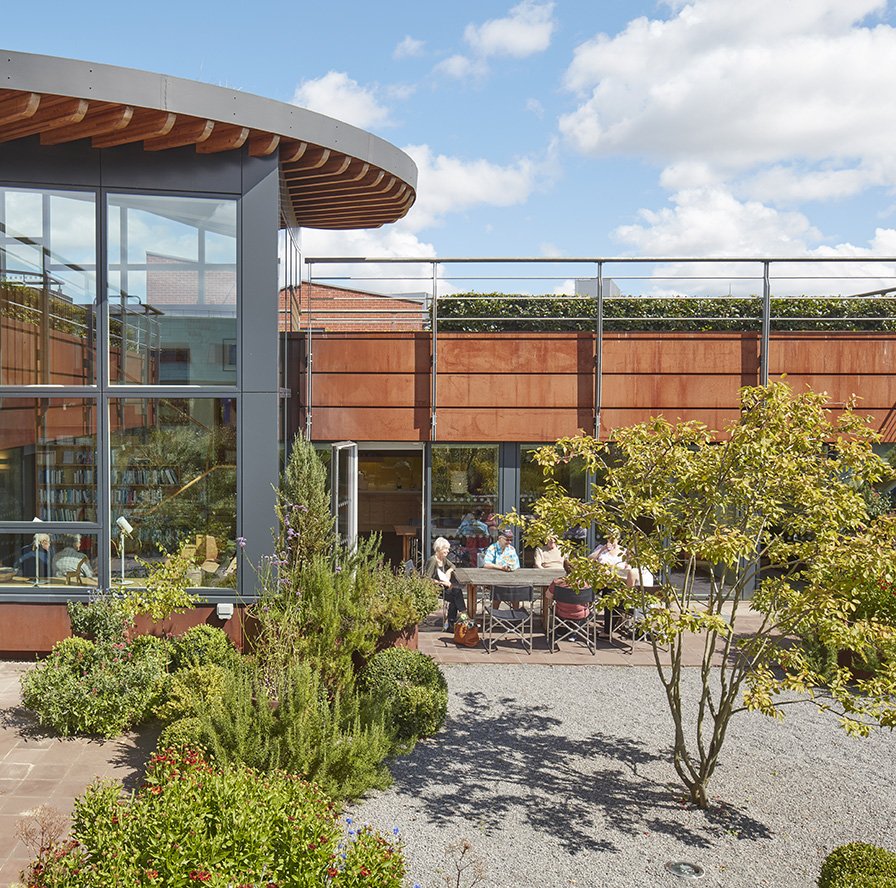
Even in apparently uninspiring public spaces, buildings can be designed to feel attractive, welcoming and open: a part of the local community. For example, Maggie’s Newcastle, a drop-in centre for people living with cancer, is set in a car park amongst clinical buildings. But with its wild garden surrounds, it is a distinctive landmark and an uplifting, positive environment.
Maggie’s Newcastle
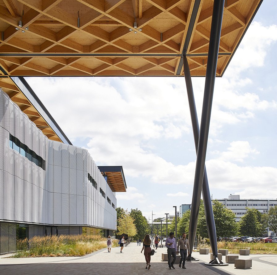
An even more striking example of ‘opening up’ is the National Automotive Innovation Centre (NAIC) – a partnership between WMG at the University of Warwick, Jaguar Land Rover and Tata Motors. Research buildings are usually hidden away in industrial parks, surrounded by car parks and screened off for IP reasons. For NAIC the idea was to foster collaboration and innovation, so Cullinan Studio were able to make the default approach ‘openness’ in a building located in the heart of the university campus. Whereas most research buildings deliver the message ‘Go away’, NAIC says ‘Come on in!’
Prof. Lord Bhattacharyya Building housing the National Automotive Innovation Centre at the University of Warwick
4) Connect buildings to nature
It is well established that a connection with nature is essential to wellbeing and happiness, and buildings that sit in harmony with nature will be more welcome in communities. Connecting to nature is at the heart of all Cullinan Studio projects. Our buildings typically incorporate gardens, green spaces and wide views over landscapes. Natural materials are also important. Timber is not normally associated with the automotive industry – we think of steel and aluminium, yet NAIC is covered by the largest timber roof in Europe.
Meanwhile, the Alder Hey Children’s Hospital is set in a new public park – a location that points to brand new ways of thinking about hospital buildings. Although the British have a deep regard for the NHS, hospitals and clinical buildings are too often visited with dread. By taking new architectural approaches and connecting them with nature, we can make hospitals pleasant places to visit, positively integrated into communities, and even loved as places of tranquillity and healing.
The Catkin Centre and Sunflower House at Alder Hey Children’s Hospital
5) Design for legibility
Buildings – particularly large buildings – integrate well if they make sense to people within their local streetscape and topography. How do pedestrians feel when passing them? Do they disorientate or confuse people? How do the buildings exist in relation to older, familiar local features?
The regeneration of the Bristol Harbourside area was a major project lasting from 2000 to 2016, and the total area includes over 600 homes as well as office buildings, leisure facilities, public squares, waterside walkways, tourist attractions, shops, restaurants and bars. Cullinan Studio’s masterplan, developed in collaboration with local communities, secured planning permission at the first attempt where previous masterplans had failed.
Key routes and vistas in the Bristol Harbourside Masterplan
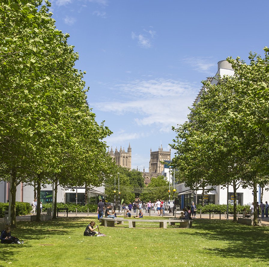
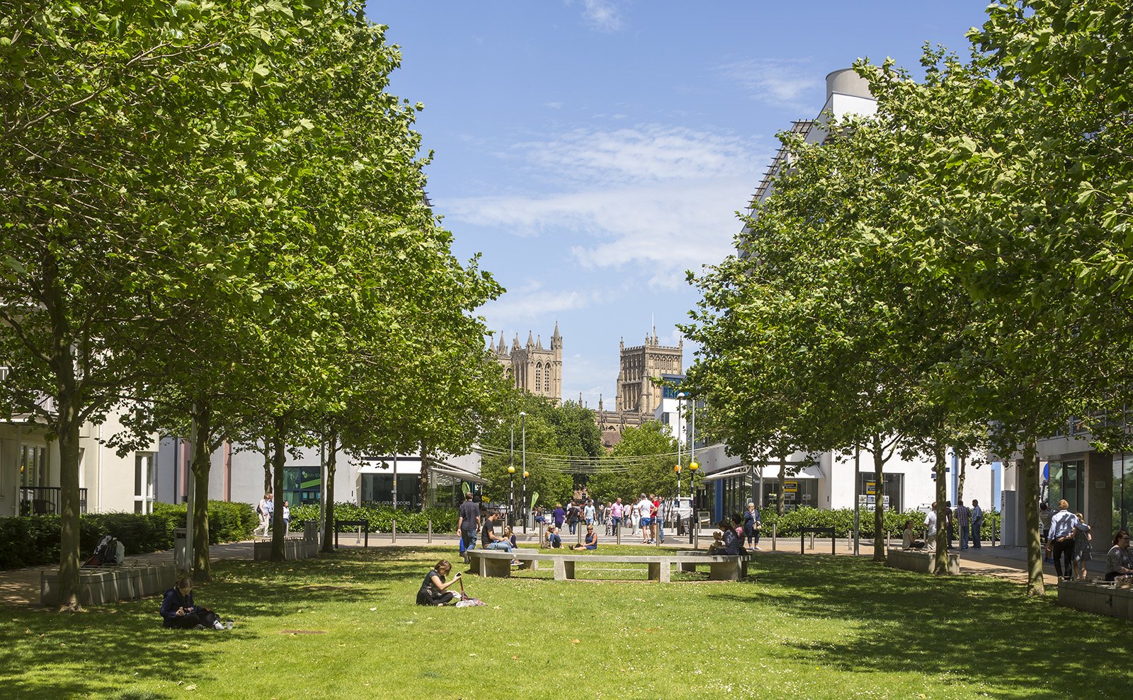
A key reason for its success is the legibility of its design. Three crossing pedestrian routes, each incorporating generous spaces and views, connect the harbourside to three local landmarks: the Cathedral, Temple Meads station and the SS Great Britain. This allows people to orientate themselves, restoring connections with the rest of the city and opening up the waterside to Bristolians and tourists.
Designing for legibility means that diverse public and private buildings, of very different ages, styles and uses, can integrate harmoniously with a local community.
A framed view of the Cathedral from Bristol Harbourside
Integrating private buildings successfully with public spaces is a complex, multi-dimensional issue that throws up challenges around design, materials, planning, understanding of the local context and much more. At Cullinan Studio we believe that good collaboration with local communities is the key.
If you would like to discuss any of the issues raised in this article, please get in touch – we would love to hear your thoughts.


