CENTRE FOR MATHEMATICAL SCIENCES, UNIVERSITY OF CAMBRIDGE
A model for the 21st century campus
From a radical ‘pavilion’ layout to passive climate control – twenty years on, the success of the Centre for Mathematical Sciences provides clear lessons for university design today. Here we identify five elements that make the Cambridge site a model campus for the 21st century…
Two decades after its completion, the University of Cambridge’s Centre for Mathematical Sciences (CMS) can be seen as a pioneering model for the Further Education campus.
Its design retains the character of a historic varsity college, but the unique layout is adaptive to the complex needs and working practices of a contemporary university. It is aesthetically striking and enjoyable, yet sensitive to its suburban location. And it prioritises the comfort and wellbeing of its users while employing a passive, low carbon approach to energy use that presages today’s concepts of operational net zero.
Cullinan Studio won multiple awards for the CMS design, including the BCI Major Projects Award, the RIBA Award and the Royal Fine Art Commission University Building of the Year Award. But even more telling is that it has stood the tests of time and use. In a 2002 PROBE study, the performance of the buildings – together with an exceptionally high level of satisfaction among academics and students – placed the CMS in the top percentile. This result was subsequently endorsed by BSRIA in a 2006 study.
“The Centre for Mathematical Sciences has now been occupied for 8 years. The building’s quality architecture and functionality are highly regarded within the University and by the mathematicians. The Centre for Mathematical Sciences is a great success and I hope there will be a further opportunity to work with Cullinans on other University projects in the future.” John Woods, Project Manager, University of Cambridge
So what are the secrets of the Centre’s success – and how can they be replicated in new campus projects today? Reviewing the project through 21st century eyes, we can identify five key elements of CMS that can and should apply to any future university developments:
1. Design should reflect purpose
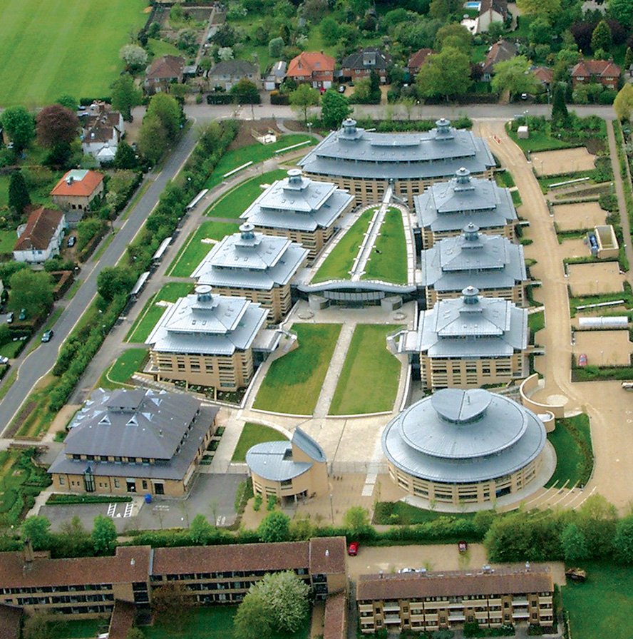
Seen from the air, the CMS has a strikingly unusual layout. There are seven pavilion research buildings clustered around a large central hub, with the circular library and gatehouse buildings in front, all opening out onto courts and gardens. But this unique design follows from a carefully considered understanding of how the university campus works, and seeks to optimise its functional effectiveness.
The University of Cambridge had identified that innovative ideas are best stimulated by interactions between people, often from different academic disciplines. The CMS campus brought together its previously separate Pure and Applied Mathematics departments, and in layout and circulation the campus is designed to allow planned and informal exchanges between users across the site, while also providing sufficient private spaces for quiet contemplative study.
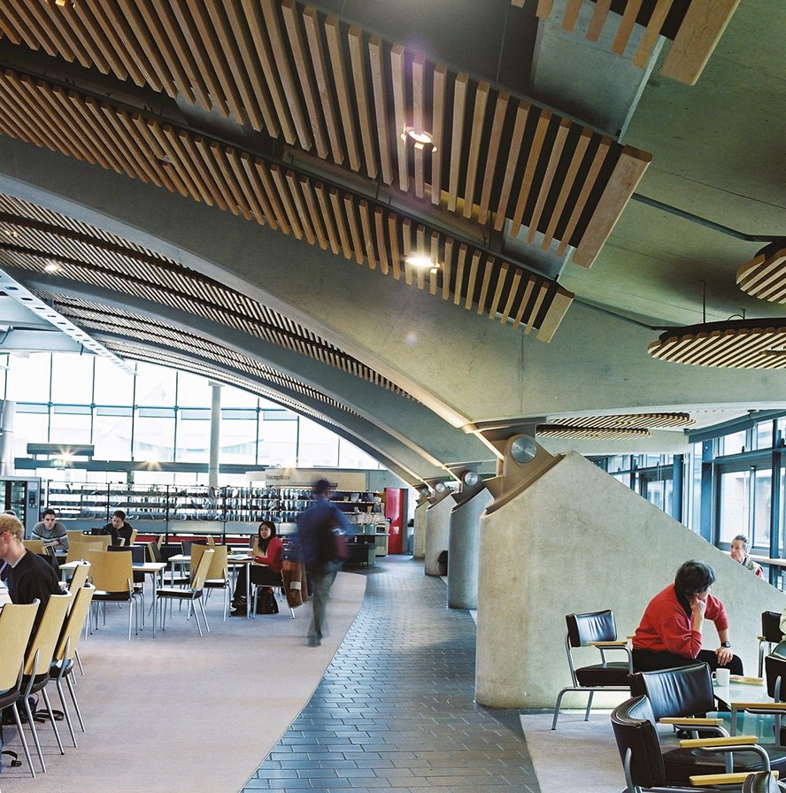
Each of the single pavilions contains approximately forty individual 13.5sqm offices for the use of individual staff, but these are gathered around circulation routes, alongside common rooms and a communal space. The pavilions are themselves each connected to the central hub building – a social and shared public area with cafe, roof garden and multiple meeting areas for different size groups. This forms the heart of the campus and gives the site a sense of unified endeavour; a vibrant, fertile space for collaborating and sharing ideas.
The pavilions are arranged for private study, for sharing ideas with your immediate neighbours and then in your shared sitting room, four of which open direct into the central core. Analagous perhaps of the graduation in confidence of young birds, from nests, perches, territory to flight.
When planning any complex, intense-use site such as a university campus, the role of the architect is to form a deep understanding of its users and its purpose, and then to find imaginative ways to create optimum conditions for fulfilling that purpose.
2. Design for the wellbeing and enjoyment of users
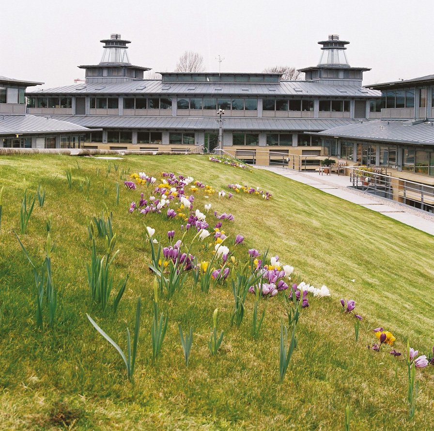
The Centre for Mathematical Sciences is designed for practicality, but also to be enjoyed by its users. For the person walking around the site it is experienced as a sequence of gardens and courtyards, with York stone paths and grass lawns – echoing the courts and quads of a traditional Cambridge college, but here including garden roofs over lecture theatres and the central communal hub. The building materials have solidity, brick and stone with the vaulted roof of the main hall of the central building including foundry-made cast joints; a beautiful, popular space.
A good building design prioritises the wellbeing of its users, and Cullinan Studio have always believed that a key to that is to connect with nature. The CMS pavilions have a park-like feeling, with natural daylight and views throughout; even the basement levels look onto sloped gardens and feel like proper outdoor spaces.
The enjoyability of the Centre’s architecture has made a measurable contribution to the institution’s appeal, with a positive impact on staff and student recruitment.
3. Employ passive design for low cost, low carbon energy use
Physical comfort is another essential part of user wellbeing. Like so many of Cullinan Studio’s projects, the CMS employs natural ventilation to keep staff and students warm in winter and cool in summer. Inside the buildings air is taken in at floor level and expelled at high level, and the design makes use of solar shading and exposed thermal mass.
The result is a campus with very low running costs – at least 20% less than the university average to maintain – and a reduced carbon footprint. Today, ‘passive’ design that harnesses nature to minimise a building’s energy consumption is ever more advanced – and an imperative in the age of net zero carbon targets.
The ‘Cambridge lanterns’ at the top of the pavilions are not only aesthetically pleasing, they have a real practical purpose: gathering in fresh air and expelling stale air, and allowing natural light into the buildings
4. Be sensitive to location
Perhaps the biggest initial challenge for the project was to somehow integrate a large academic institution into a suburban environment; to introduce a series of intense-use buildings into a residential neighbourhood without dominating it or transforming its character.
West Cambridge is an area of large, architecturally-varied villas set in their own grounds, and ever since the idea of locating a new university faculty in its midst was mooted in the early 1990s there had been vocal concerns from nearby residents that it should not overwhelm the area.
Cullinan Studio’s solution was to design the pavilions to reflect the spacing and scale of the existing houses surrounding the site, and to suppress the large lecture theatres and communal spaces deep within the site, both in height and location.
Twenty years on, the Centre for Mathematical Sciences is a model for a surburban or semi-rural campus – with lessons that can be directly applied to future further education developments on similar out-of-town sites.
5. Design for flexibility at every stage
Right from the start of the project, we knew that the campus would have to be adaptive to the vagaries of fundraising. It would need to be occupied and usable before it was complete, with potentially years separating each construction phase.
Cullinan Studio’s concept of the discrete individual pavilion as the main compositional component of the site provided the solution. It would allow the campus to operate while only partially built, and accommodate the fact that any one group within the departments might receive funding ahead of another. As it turned out, construction was completed in three phases between 1998 and the end of 2002, with the designers and contractors developing efficiencies and improved methods at each stage.
Not only did the pavilion concept allow us to adapt to the nature of university fundraising, it actually helped to drive it. Since the project relied to a large extent on donations from alumni, the ability to name each individual pavilion after a benefactor became a significant factor in attracting donations.
Again, there are clear lessons for future university projects: when planning a new campus, designers must take into account the realities of how academic institutions are funded. And once complete, the flexible, modular nature of the design means that the campus can adapt to future expansion or change in the Centre for Mathematical Sciences operations, giving the site real long term durability.
Defining a material language to emphasise walls and corners.
Awards:
BCI Major Projects Award
RIBA Award
Royal Fine Art Commission University Building of the Year Award
David Urwin Award
If you would like to discuss any aspect of SMU or Cullinan Studio’s approach to masterplanning, email roddy.langmuir@cullinanstudio.com


